Shannon Orthodontics
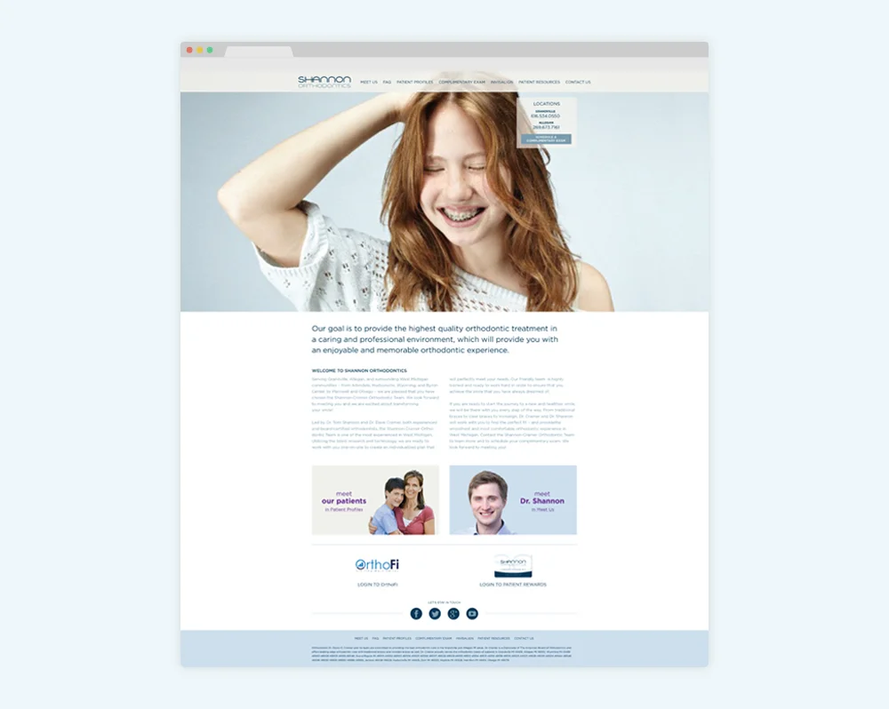
Dr. Tom Shannon oversees a thriving orthodontic practice in several parts of West Michigan. He needed both a brand and an identity that would reflect his modern approach to serving patients, and his dedication to their well-being.
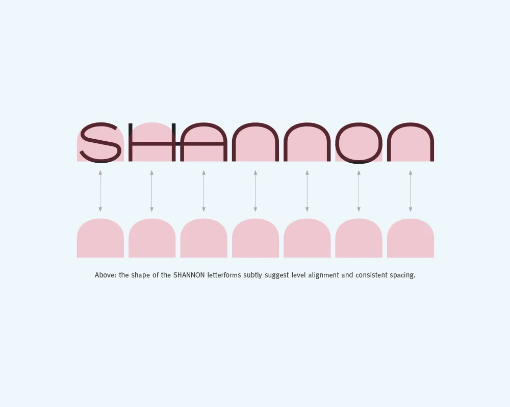
Following research that reflected themes of alignment and spacing,
I created a logotype that features evenly distributed tooth-inspired letterforms to convey the balance and consistency commonly associated with a beautiful smile.
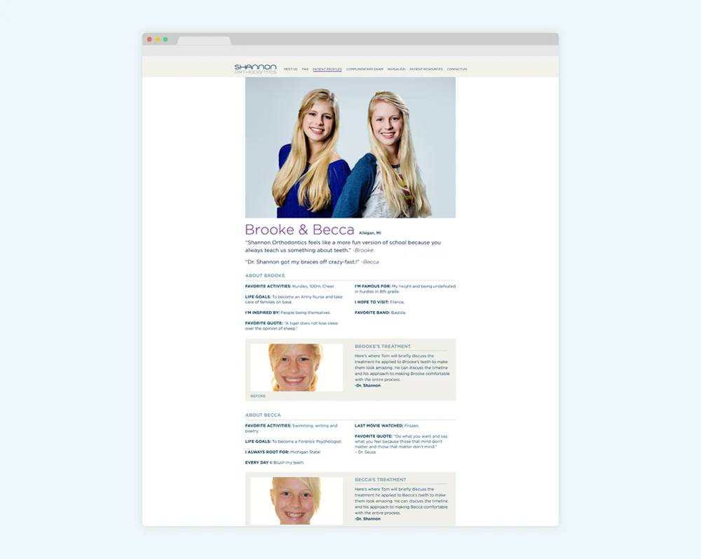
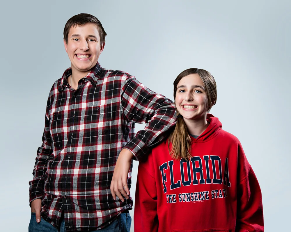
When it came time to redesign Dr. Shannon's web presence, it was important to rethink the staid and traditional patient testimonials that are the hallmark of so many medical practice sites. Patient Profiles were created to feature patients as relatable people valued by the practice, not just reviewers.
Since launching the Shannon Orthodontics' rebrand, business has grown, allowing Dr. Shannon to open a third location.


ABOVE: Additional logo options included as part of the original identity presentation.